Tuesday 25 December 2012
Monday 24 December 2012
Invisible ink-Lemon juice
I
looked another way of making text appear which was by writing the text out with
lemon juice. I do not think this is a good way of making the text appear
because the text comes out in a dirty yellow colour, which doesn’t look very
futuristic, or romantic which is what we want to portray in our title sequence.
So although this way of producing invisible ink does work, the style of it does
not suite the mood of the title sequence therefore I do not think we should use
it.
Squeeze lemons to obtain their juice or
obtain bottled lemon juice.
Use the juice as 'ink' by applying it to
a stick or paintbrush and writing on paper.
Allow the paper to dry.
When you are ready to read your
invisible message, hold the paper up to sunlight, a lightbulb (recommended), or
other heat source.
The heat will cause the writing to darken
to a pale brown, so your message can now be read.
Another way to read the message is to
put salt on the drying 'ink'. After a minute, wipe the salt off and color over
the paper with a wax crayon to reveal the message.
Sunday 23 December 2012
Invisible ink- Pen
I
firstly came across on YouTube a pen you can use to write with then shine a UV
light on to make the text appear. To do this way of making text appear as a
group we would have to buy of the internet to use. But just like the lemon
juice idea above I do not think this writing completely suits the style and
mood of our title sequence. I think this because to see the text you have to
shine a brightly coloured light over the text which I think ruins it. I don’t think
it makes it look sad or romantic at all which is the main mood of our title
sequence. The only good thing about using this way of making the text appear is
that it looks quite futuristic which is what we also wanted to reflect in our
title sequence. But I think it is too much and will not mix well with the setting
and mood. So overall I do not think we should use this way of showing the
invisible ink because it doesn’t suite the title sequence how we want it to.
Saturday 22 December 2012
Friday 21 December 2012
Invisible Ink
Because
we decided to use some form of invisible ink for our titles I decided to
research on different ways in which we could do this. I firstly looked at what
invisible ink is..
Invisible ink, also known as security ink, is a substance used for writing, which is
invisible either on application or soon thereafter, and which later on can be
made visible by some means. Invisible ink is one form of steganography, and it has been used in espionage.
I
then looked at the different ways we could make the ink either appear or disappear.
I did this by researching on the internet and watching videos on YouTube of people
that have previously done this. I came across things such as pens that are made
specifically for writing in invisible ink that come with a UV light to make it
appear, or more complex and natural ways like using lemon juice and a light to
make text appear.
Above
this are a few videos I came across of different techniques that can be used to
produce invisible ink.
Thursday 20 December 2012
Film studio's
Film studio Research
I have
started to research and decide upon the film studios who I think will be good
to produce mine Daisy’s and Sean’s film.
Examples of some of the most famous
film studios are:
· Paramount
· Dreamworks
· Pixar
· Warner Brothers
· Universal
· Walt Disney
· Marvel
· Film 4
· Nickolelodeon
How films are produced and
distributed:
· Producer finds film…
· Distributer to market the film pays
for cinema…
· Customer watches and pays for the
film…
· Money goes back to the distributer.
Paramount Vantage
We
decided that paramount vantage would be the best film studio to suit producing
our film. This is because the films they have produced in the past are quite
similar to ours as they are of the same genre and have similar themes.
Films
•American
teen
•Into
the wild
•No
country for old men
Case
39
•The
eye
Type
of genres they produce:
Paramount vantage produce a lot of films
based around comedy and drama. Obviously the comedy part does not relate to our
film but our film is widely based around drama. They bad thing about paramount
vantage is they have not produced a lot of love/romance films which is the main
theme of our film. But they have produced films such as American teen which is aimed
at
young teenagers which is also the main audience we plan to aim our film at.
Monday 17 December 2012
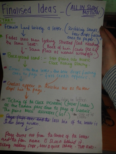
Filming plan
Today me and Daisy decided on the official plans for filming our title sequence. We discussed things such as the location, props and who will be in charge of what.
Location
Daisy's house- We decided on Daisy's house because we feel like it is the most appropriate setting as she has the right props needed at her home already that we have planned to include. Also the rooms i her house have the right lighting and atmosphere.
Props
- cigarettes
- desk/table
- lamp
- chair
- ash tray
- paper
- pen
Setting
We have decided to film our title sequence around four o'clock and onwards as by that time it will be dark and we want our sequence to be set in the night time, so it is more dark and tense. Also so it seems more upsetting which will emphasis the sadness of the loss of Arrow and her saying goodbye through her letter.
Actors
Daisy is going to play Arrow
Todd Harding is going to play Finn
We decided on these two people as out of all the people we know they fit the actors we originally chose to be in our film (Joseph Gordan Levitt and Rooney Mara.)
We decided to film with a flip camera.
Director/person filming: Me
Font (in charge of typography and deciding on pen/invisible ink): Sean
Producer: Daisy
Wednesday 12 December 2012
websites we have used so far:
the website we are on for finding a piece of music is:
https://audionetwork.lgfl.org.uk/
the website i used to help me research types of font was:
http://www.dafont.com/
https://audionetwork.lgfl.org.uk/
the website i used to help me research types of font was:
http://www.dafont.com/
questionnaire - audience researching
In order to help us decide on the type of music we are going to use for our title sequence we have decided to ask a range of people for their opinion. We are going to show them several clips of music and see what piece of music gets the best feed back, also what piece of music,a selection of audiences believe is appropriate for our title sequence. We are going to ask a range of people such as males and females of various ages. We are going to do this so we get a range of opinions. We have planned to ask them the following questions..
MUSIC QUESTIONNAIRE
I will play a selection of people 4 of my final choices of the music we are contemplating to use for our title sequence.
If you were to hear this song in a title sequence, what genre would you expect the film to be?
What do you think the initial mood of this piece of music is?
What kind of films have you heard music similar to this being played in?
What kind of themes would you relate to this piece of music?


Tuesday 11 December 2012
Now we know what is actually going to be
involved and happen in our title sequence we have started looking at music,
sound, typography and effects. We have looked at what will and what will not
suit our title sequence and have came up with a rough idea of what we would
like to include. We started of by looking at sounds. We need to decide on the
clock sound we decided to include, fading in to our title sequence and the soft
piano music that will be playing quietly in the background. Underneath this
post is a few of our first ideas for typography.
Monday 10 December 2012
Sunday 9 December 2012
Music options
https://soundcloud.com/daisy-preston-pratt/imagery
https://soundcloud.com/daisy-preston-pratt/anw1551-07-flight
https://soundcloud.com/daisy-preston-pratt/imagery
https://soundcloud.com/daisy-preston-pratt/curiosities
https://soundcloud.com/daisy-preston-pratt/anw1551-07-flight
https://soundcloud.com/daisy-preston-pratt/imagery
https://soundcloud.com/daisy-preston-pratt/curiosities
Typography ideas
1.
2.

3.

5.
6.

7.
These are just a few ideas as to what i would like the typography for our title sequence to look like. We were going for the look of a handwritten style for the credits as it is supposed to be as if they are appearing on a letter. We also had the idea of the writing appearing on the paper by invisible ink this is why i like number 6 the best as it is a bit cracked and faded as if it hasn't developed on the page properly. I think number 6 out of all of these would work the best because i think it will fit in with the idea of appearing in invisible ink the best, also it is quite a feminine style of writing which we need as the letter has been written by the women in the film. Also i think it will work the best because where it is slightly faded it emphasises the idea of our main characters disappearance. Out of all of these styles i think number 3 is the worse choice as i think it looks too bubbly and happy which goes against the mood of the letter and atmosphere of the title sequence as it is supposed to be quite tense and upsetting. I do not think number 1 would be very successful because i think it would be quite difficult for people to read as it seems quite hard to understand and as titles appear and fade quite quickly people may not have time to try and work out what they say. So overall so far number 6 is my main choice of typography for our title sequence.

Codes and conventions
Codes and Conventions
An opening sequence of a film
will contain:
·
Details of cast and crew
·
The films title (font type Is key to this)
·
An introduction to character or character type
·
Indication of place
·
Indication of historical period
·
Information regarding mood and tone
·
Introduction to signature theme tune
·
Information about genre
·
Questions that the viewer finds intriguing
·
Patterns and types of editing that will be echoed in the
remainder of the film
·
Mise en scene and cinematography that will be echoed or
elaborated upon later in the film
Saturday 8 December 2012
A time to love.
We finally decided on a film name for our film. We have decided to call it "A time to love." We decided on this because we feel like it includes the two main themes of our film time travel and love, but i do not think this title gives away the time travelling side of the film,which is a good thing because it leaves the audience un aware of the main twist in the film. I like this film title because i think it can have many different meanings either positive or negative.
Friday 7 December 2012
cinematography for my title sequence
I have been
looking at cinematography that I think would work well in mine Daisy’s and
Sean’s title sequence. I have mainly been focusing on different shot angles and
think it would be good to include the following:
· Extreme close up: As I think this will portray the emotions on the main characters that
are involved in the title sequence well as the audience will be able to see
them clearly.
· Medium Long shot: I think this shot will be good as it will reveal just a little of the
environment and setting of the film but will not give too much away.
Shots that I
don’t think will work are:
· Long shots:
because I think this will reveal too much of the setting and possibly give too
much away, where I want it to be kind of mysterious.
· Over the shoulder: this shot will not work because we don’t want more than one person in
each shot because the two characters are meant to be separated.
Subscribe to:
Posts (Atom)