Below this
post in my continuity sequence i filmed with Sean and Harry. To do this i
filmed individual shots making sure nothing was out of place such as
positioning of the props and the camera. After i had filmed each section i
edited them together so make one whole clip, trying to make sure it ran
smoothly continuously throughout. I found this task fun but at times difficult
as i had to make sure the camera was always in the same place, none of the
props/ actors were out of place and in different places to what they was in previous
shots. To edit this sequence i had to cut certain sections from the clips i had
filmed and remove them so the next clip ran well with it and it was all in
order. I also had to make sure we included all the right angle shots such as
over the shoulder, close ups and long shots. We also had to include in this
continuity sequence the 180 degree rule where the camera has to stay one side
only of what is being filmed. Over all i think this continuity sequence was successful
as we got all of the shots done and i think i edited them quite well and
smoothly together. I also didn’t miss out any important sections of the sequence
where it jumps from one thing to a complete other without making sense.
Thursday, 6 December 2012

The importance of typography and design.
Today in
Media we looked at the importance of typography and design. Typography in a
title sequence can be important as it is another indication of the genre of
film and what it may be about. The style of the writing can indicate genre for
example soft
curly text may indicate
a romance/ happy film whereas dark bold text may indicate action/drama. Style
of text reflects the films over all mood and meaning. Not only is typography
about the style of writing but the involvement of the text with the actual title
sequence.
We looked at
the style of typography used in the title sequence for the film “Catch me if
you can.” In this title sequence the text is presented in quite a soft flowing
style which intertwines with the action occurring in the title sequence. The text
interlinks with the story that is being shown where it creates the set of the
story for example the writing falls down to form a ladder which the character
then climbs up. The typography/ title sequence for this film looks as if it is
influenced by Saul Bass as it is done in the style he used to work with which i
have previously looked at and analysed. This use of typography is a perfect
example of the importance of typography in a title sequence as it can often be
involved in telling/ hinting to the audience the story and indicating certain
aspects of the film.
Wednesday, 5 December 2012
Recently in
media we have been planning on making our own title sequence for our films. As we
have previously been analysing different types of films and there title
sequences i know a lot more about the importance and meaning of title sequences
also what and what not to include in them. We have been brain storming within
our group’s things we might decide to include in our title sequences. The main
thing we had to pay attention to when coming up with ideas is to not give the
story away too much. We have so far come up with several good ideas of what to
do and we are in the middle of finalising them down to just one we decide to go
along with.
Thursday, 29 November 2012


Thursday, 22 November 2012
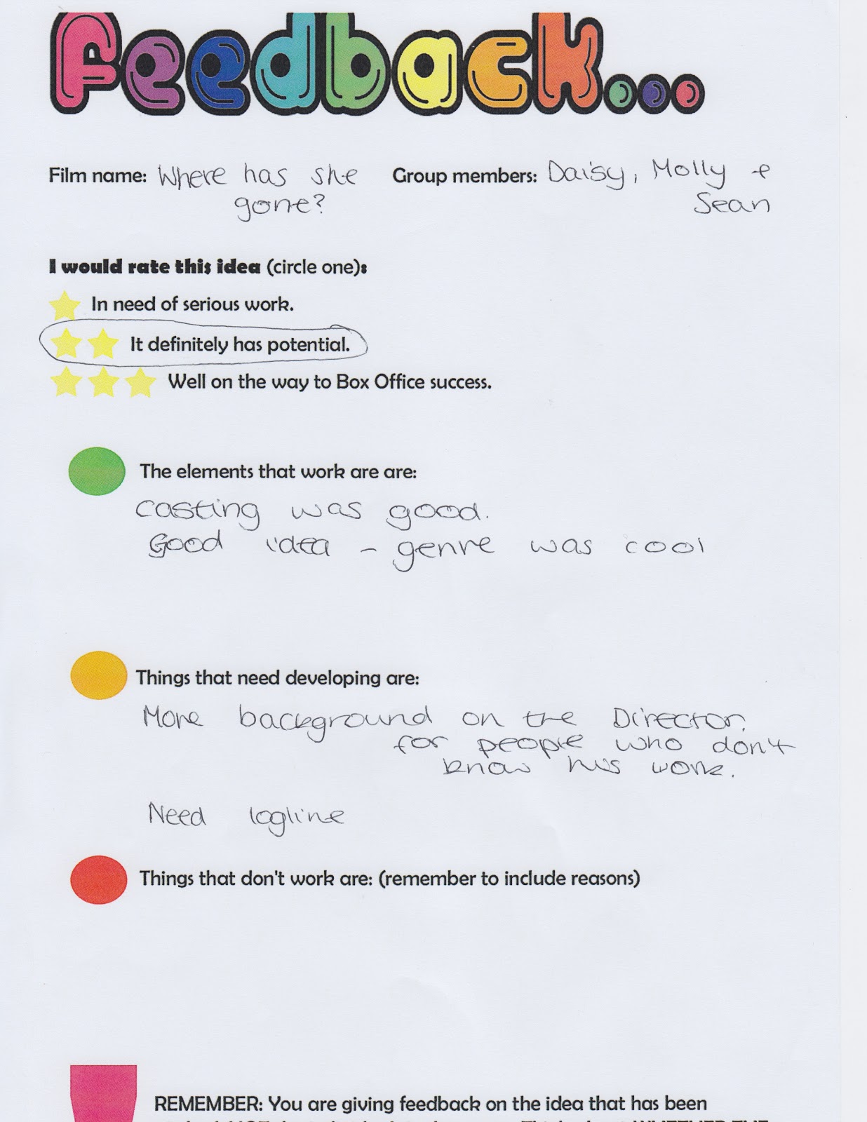
Underneath is my power point for the film me, Daisy and Sean made ideas for and are planning to do a title sequence for. I don’t think our presentation was very successful as we didn’t include all the important parts needed for our film such as the log line. We also weren’t very good with the cost of the film as it was decided we would need a lot more money to produce then we planned. Also we didn’t think properly on the film name, which will need to be changed.
Over all are film ideas in general were interesting to people, but we just needed to do a bit more research on actors, directors and the cost of the film.
Subscribe to:
Posts (Atom)