https://soundcloud.com/daisy-preston-pratt/imagery
https://soundcloud.com/daisy-preston-pratt/anw1551-07-flight
https://soundcloud.com/daisy-preston-pratt/imagery
https://soundcloud.com/daisy-preston-pratt/curiosities
Sunday, 9 December 2012

Typography ideas
1.

2.

3.

5.
6.

7.
These are just a few ideas as to what i would like the typography for our title sequence to look like. We were going for the look of a handwritten style for the credits as it is supposed to be as if they are appearing on a letter. We also had the idea of the writing appearing on the paper by invisible ink this is why i like number 6 the best as it is a bit cracked and faded as if it hasn't developed on the page properly. I think number 6 out of all of these would work the best because i think it will fit in with the idea of appearing in invisible ink the best, also it is quite a feminine style of writing which we need as the letter has been written by the women in the film. Also i think it will work the best because where it is slightly faded it emphasises the idea of our main characters disappearance. Out of all of these styles i think number 3 is the worse choice as i think it looks too bubbly and happy which goes against the mood of the letter and atmosphere of the title sequence as it is supposed to be quite tense and upsetting. I do not think number 1 would be very successful because i think it would be quite difficult for people to read as it seems quite hard to understand and as titles appear and fade quite quickly people may not have time to try and work out what they say. So overall so far number 6 is my main choice of typography for our title sequence.

Codes and conventions
Codes and Conventions
An opening sequence of a film
will contain:
·
Details of cast and crew
·
The films title (font type Is key to this)
·
An introduction to character or character type
·
Indication of place
·
Indication of historical period
·
Information regarding mood and tone
·
Introduction to signature theme tune
·
Information about genre
·
Questions that the viewer finds intriguing
·
Patterns and types of editing that will be echoed in the
remainder of the film
·
Mise en scene and cinematography that will be echoed or
elaborated upon later in the film
Saturday, 8 December 2012
A time to love.
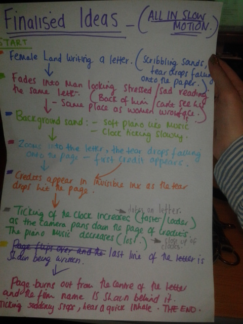
We finally decided on a film name for our film. We have decided to call it "A time to love." We decided on this because we feel like it includes the two main themes of our film time travel and love, but i do not think this title gives away the time travelling side of the film,which is a good thing because it leaves the audience un aware of the main twist in the film. I like this film title because i think it can have many different meanings either positive or negative.
Friday, 7 December 2012
cinematography for my title sequence
I have been
looking at cinematography that I think would work well in mine Daisy’s and
Sean’s title sequence. I have mainly been focusing on different shot angles and
think it would be good to include the following:
· Extreme close up: As I think this will portray the emotions on the main characters that
are involved in the title sequence well as the audience will be able to see
them clearly.
· Medium Long shot: I think this shot will be good as it will reveal just a little of the
environment and setting of the film but will not give too much away.
Shots that I
don’t think will work are:
· Long shots:
because I think this will reveal too much of the setting and possibly give too
much away, where I want it to be kind of mysterious.
· Over the shoulder: this shot will not work because we don’t want more than one person in
each shot because the two characters are meant to be separated.
Subscribe to:
Posts (Atom)